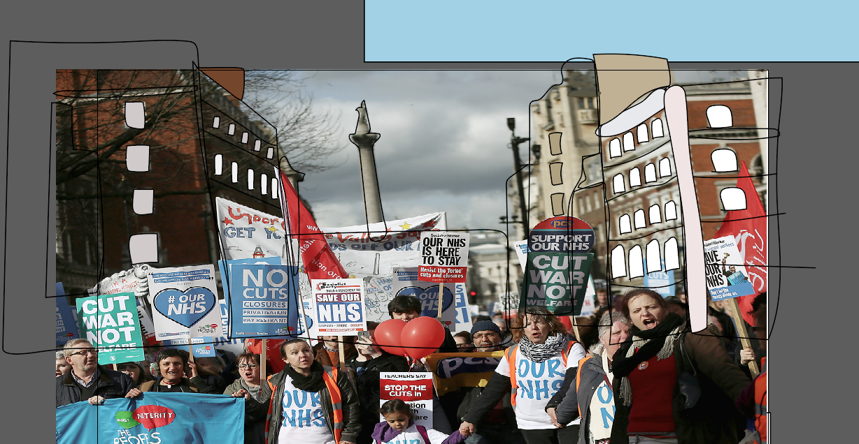
One scene that I am really proud of in particular is the protest scene. It was a very long process creating this on illustrator and then making it move using After Effects. I had to create a lot of layers to make this work and it was very confusing trying to work out where to place each layer so that they were in the correct order for it to create the look I wanted and to make all the individual pieces move in the correct way.
One thing that I am a bit concerned about is there is a bit of a difference in detail level between the figures I created for the background and the few main character which I have spent a lot of time creating their individual features. If I had more time I would develop some of the background people more and to make more of their features able to move.
I decided to take a real image from the London protest and to trace parts of it, so that it kept true to the real thing. I specifically chose an image in which it was obvious it was London based. This wasn't crucial to my work but I am just a very proud Londoner, so it was personal to me.
It was also really important to me to use real banners to stay true to the real rally and the whole ethos of the message I am trying to convey in my work, and although this was a risky choice, I am very happy with the outcome. It doesn't fit entirely with the aesthetic of everything but given the context I think it works and is a very forgivable offence.
Saturday, 13 May 2017
Another technical challenge
Another technical challenge I faced was making Albert walk through the street. In the end I developed this movement in a different way. i created separate layers for each step so that I could just stagger them over the background. This turned out to be problematic when working out the timings and could have been smoother if I had used a different method, but I am still happy with the movement which I created in this scene. In the future I would like to experiment with the different ways to approach these kind of issues. As I think that this created a minor problem with the speed of this section.
The cat
One of my favourite parts of my animatic is the cat character, he plays a key role in the piece. He creates subtle comedy throughout by engaging in conversation with Albert and disapproving of his harsh and mean actions.
I have designed him as an emotional character. My favourite part of this character is when he sheds tears. I created the tears on a separate layer so I could use keyframes to make them opaque and then bring them in when needed.
What is most effective about the cat is that his movements are really subtle but make a big difference to the aesthetic. His mouth changes depending on whether he is happy or sad. He even comes to the London rally in the end when Albert has seen the light and holds a placard.
I have designed him as an emotional character. My favourite part of this character is when he sheds tears. I created the tears on a separate layer so I could use keyframes to make them opaque and then bring them in when needed.
What is most effective about the cat is that his movements are really subtle but make a big difference to the aesthetic. His mouth changes depending on whether he is happy or sad. He even comes to the London rally in the end when Albert has seen the light and holds a placard.
Technical elements
Getting to know the technology and the software was a real challenge for me, I have found that animation is a long process, and being an impatient person, I struggled with this to begin with.
Movement throughout my animation was a struggle at times but I now feel a lot more comfortable with After Effects and the transition between Illustrator and After Effects.
One thing I learnt was how to make characters faces move, for example blinking, smiling and raising their eyebrows. It took me a while to learn all this as I chose to make my protagonists face move quite intricately, with a lot of facial detail including wrinkles, which move at certain points throughout my animatic.
I used the transform settings to add keyframes and manipulate layers in the scene.
Movement throughout my animation was a struggle at times but I now feel a lot more comfortable with After Effects and the transition between Illustrator and After Effects.
One thing I learnt was how to make characters faces move, for example blinking, smiling and raising their eyebrows. It took me a while to learn all this as I chose to make my protagonists face move quite intricately, with a lot of facial detail including wrinkles, which move at certain points throughout my animatic.
I used the transform settings to add keyframes and manipulate layers in the scene.
Contrast in environments
As I mentioned before, as part of the aesthetic I have created I was keen on developing a clear contrast between Albert and the rest of the world. key to this has been colour, when designing the inside of his house. I used almost all grey colours for the furniture etc. I also made it really crooked in terms of shape as well. I think this has worked really nicely. It reminds me a little bit of the style of Salad fingers. A bit quirky looking.
In contrast to this, everything about the outside world is colourful and vibrant in atmosphere. I have tried to reflect this further using elements such as sound the busy bustle of the urban city in comparison against the sound of the static when the television is turned on in Albert's house.
I carefully considered this when I was creating scenes for example the one where both of these worlds meet each other, when the activist stands at his door.
I think the contrast in these images is really effective in showing this barrier between the protagonist and everyone else. This helps to portray him in a vulnerable and isolated way.
Creating the main protestor character
When designing my opposing character, the NHS activist I really wanted her to be as different as possible from Albert the protagonist. This is also true of the settings. Albert's house is really dark and crooked, a bit like him! So I wanted there to be a contrast as soon as the audience sees the outside, so I have used bright colours in this design. I decided since Albert was inspired by a character from Up, it would make sense for his opposition to look like a disney princess. I took close inspiration from Disney princesses such as Elsa from Frozen and Belle from Beauty and the beast.
Thursday, 11 May 2017
Tracing
In class, we started tracing some images to scan into illustrator to play around with, we used LED light panels to help us trace, they were really useful when looking at some of the finer details.
Subscribe to:
Posts (Atom)