Throughout this module I have really developed my skills in to Adobe programmes I have not been familiar with before and I have really gained an understanding of the end to end process of animation. As an impatient person I can conclude that creating an entire animation is definitely not for me! But I am very keen on the illustration element of this, so maybe this is something I will harness in the future.
I feel much more confident and comfortable approaching a project of this size which is something I was really worried about to begin with. I have enjoyed many aspects of this module.
Tuesday, 16 May 2017
Recent animation
Recently I have shown much more of an interest in animation. I have been watching Rick and Morty. It is one of my favourite shows! It is an adult animation. It follows a mad scientist and his grandson on their far fetched and hilarious adventures. I admire the aesthetic of the show.
“The existential nihilist judges human existence to be pointless and absurd. It leads nowhere and adds up to nothing. It is entirely gratuitous, in the sense that there is no justification for life, but also no reason not to live.” explains the author DONALD A CROSBY. This is particularly evident in the protagonist Rick, an old mad scientist.
The show has a message which is that human life has no purpose, so we should just have fun whilst we are here. This is clear through the characteristics and attitude that Rick has. This is very funny. The aesthetic also reflects this with bright pastel colours and crazy random characters popping up throughout.


Rotating an item around an anchor point
I watched some youtube tutorials to help me figure out how to move items around a specific point so I could move Alberts arms without them become completely detached from his body. Firstly I had to select the item I wanted and to use the transform tool to modify the anchor point of the item to where I wanted it to rotate around.


Then I had to use the rotation tool to choose where and how it rotates.


Further character development
I have created different layers for when Albert is walking down the street, I followed a guideline from google and hopefully when i import the file into After effects I will be able to stagger the layers making it look like Albert is walking down the street

I have also made a new illustration for when Albert has a heart attack with multiple layers for his different arm movements and different mouth positions!


I have also made a new illustration for when Albert has a heart attack with multiple layers for his different arm movements and different mouth positions!

Making my protagonist (Illustrator)
I used a character from Up as an initial template as I wanted to to take small elements like the size and shape of his head and use them as a base for my protagonist

 I used illustrator which I have never worked with before but I really like it, i prefer it to photoshop. Especially when it comes to creating illustrations (funnily enough). I used the old man from Up as my template on an initial layer and worked roughly from this to make a character of my own.
Creating different outfits and movements such as walking will be a different challenge!!!


Creating different outfits and movements such as walking will be a different challenge!!!
KUBO
A recent piece of animation I watched was Kubo and the two strings which is a fantasy adventure film directed by Travis Knight, a 3d stop motion animation. I really like the aesthetic and style of this animatic piece. The quirky sound also works really well with the visual. It feels really original. The movement of this film is really visually pleasing and appeals to adults as well as children.
Stop motion animation is something that really appeals to me but seems far too ambitious for such a short period of time. I will definitely consider working with this kind of animation in the future!
I love the design of the characters!!

Stop motion animation is something that really appeals to me but seems far too ambitious for such a short period of time. I will definitely consider working with this kind of animation in the future!
I love the design of the characters!!

Final shot (information)
After researching I have decided to keep the information simple and take influence some of the facts from the Keep Our NHS public page. This shot will go at the end of my piece for 4-6 seconds depending on the whole things running time.
Visually it needs to be simple and bold. So I will use a colour scheme which reflects urgency; black, white and red
I am also going to use a placard image which has been used throughout my animation, on the leaflet that the girl brings to Alberts door as this works to reinforce the message of the piece.
I am also going to include a link to the Keep Our NHS Public page where the audience can find out more about the movement if they want to.

This is the finished piece, I have added the bottom line as a separate layer so I can fade it in.
NHS cuts research
In my research I looked for some examples of the consequences of the recent budget cuts and privatisation. I looked at a case study of a lady working as a paramedic.

I read about the lack of breaks and how tired the staff of the NHS are after constant downsizing and redundancies in these conditions.

I read about the lack of breaks and how tired the staff of the NHS are after constant downsizing and redundancies in these conditions.
Credits
At first I had planned to create rolling credits in the end of my animation like in a film but now, seeing my piece come together I have decided to keep them very simple and brief as not to distract the audience from the real show.
I am going to make them very concise and will probably only include the title and my name.
Here are some font types I have tried out:
 I have decided to use the second font in this list as it fits the aesthetic I am trying to create throughout the animatic Its quirky, simple and visually pleasing, I am going to do an outline of the text so it looks.
 Here is the finished product
I am going to make them very concise and will probably only include the title and my name.
Here are some font types I have tried out:


Project brief reflection
Cause and effect:
Select a historical, environmental, cultural or economic event and investigate its cause and effect. Devise an animated story that relays the human impact that your chosen event has had
The event I chose for my piece was the London NHS march on the 4th March 2014. I chose this because it is something I am personally very passionate about and it is also a very current issue so I can make informing and influencing my audience the key aims of my piece.
I am going to include a slide of information at the end to try and inform successfully, to show that despite the animation having a comic value it is still based on a serious issue. I will try and keep this information pretty simple so that it is still accessable which is something I've said I wanted to achieve from the start.
This issue covers both a cultural and economic theme which I have investigated, alongside my prior interest in politics. This module has definitely stimulated me further in my political views and interests.
Human impact is the main issue that I follow and how every person counts in making a difference.
Monday, 15 May 2017
Narrative strategies (reading)
Multiplicity of styles/ approaches - telling story or expression thought and emotion
sequence, causes, effects
METAMORPHOSIS
an image to literally change into another through manipulations of clay, objects, environments
-- caroline Leaf - THE STREET
Link on flat plate of grass
--BETTY BOOP snow white ( I really liked the style of this, very aesthetically pleasing)
Condensation
short form
elliptical cut, comic elusion
dissolve, fade in and out
hyper realism, projection, historical fact
--narrative premise- relevant outcome
Home on the rails (1981) uses cartoon, train runs through the house, hyper realism, absurd comedy!
Session reflection
Ideas
-death david bowie - art is immortal
-2015 refugee crisis - syria
-NHS privatisation
STAGES OF ANIMATION
Concept- story
treatment- plot + script
visualisation- exploratory sketching
research- character/ prop design/ layout
Sound and music / animatic
Animation
Audio/ sound in sync
TITLE, CREDITS, COPYRIGHT
PROTAGONIST -
equalibrium DISRUPTION- QUEST- CLIMAX - RE-EQUALIBRIUM
ANTAGONIST -
Storyboarding
-sense of the plot
sense of movement
maximum 6 pages
Framing inc people and objects, which the animators want us to see
relationship between these is very important - focus o dominant things in scene
rule of thirds composition something to consider!
Design should be simple
angles, placement
Figure of expression big part of mise en scene, appropriate aesthetics to chosen concept and narrative
set and props should relate to story
Saturday, 13 May 2017
Sound
A really crucial element for my animatic, which was challenging at points. It is difficult to make the volume of each different sound clip to each other and also to the visual footage. I used a range of free non copyright websites to find the sound clips I used. I also used some voice note recordings for the verbal parts of my animatic.
I had to watch a few Youtube tutorials in order to know how to interact with these files to make them do what I wanted.

I am pleased with how the sound in my work came together, but I definitely think there is room for improvement in the future, I would like to be able to create all my own sounds from start to finish in my next animation project I think.

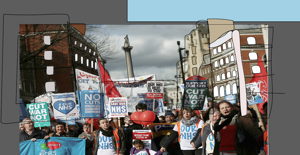
The protest scene
One scene that I am really proud of in particular is the protest scene. It was a very long process creating this on illustrator and then making it move using After Effects. I had to create a lot of layers to make this work and it was very confusing trying to work out where to place each layer so that they were in the correct order for it to create the look I wanted and to make all the individual pieces move in the correct way.
One thing that I am a bit concerned about is there is a bit of a difference in detail level between the figures I created for the background and the few main character which I have spent a lot of time creating their individual features. If I had more time I would develop some of the background people more and to make more of their features able to move.
I decided to take a real image from the London protest and to trace parts of it, so that it kept true to the real thing. I specifically chose an image in which it was obvious it was London based. This wasn't crucial to my work but I am just a very proud Londoner, so it was personal to me.


It was also really important to me to use real banners to stay true to the real rally and the whole ethos of the message I am trying to convey in my work, and although this was a risky choice, I am very happy with the outcome. It doesn't fit entirely with the aesthetic of everything but given the context I think it works and is a very forgivable offence.
Another technical challenge
Another technical challenge I faced was making Albert walk through the street. In the end I developed this movement in a different way. i created separate layers for each step so that I could just stagger them over the background. This turned out to be problematic when working out the timings and could have been smoother if I had used a different method, but I am still happy with the movement which I created in this scene. In the future I would like to experiment with the different ways to approach these kind of issues. As I think that this created a minor problem with the speed of this section.


The cat
One of my favourite parts of my animatic is the cat character, he plays a key role in the piece. He creates subtle comedy throughout by engaging in conversation with Albert and disapproving of his harsh and mean actions.
I have designed him as an emotional character. My favourite part of this character is when he sheds tears. I created the tears on a separate layer so I could use keyframes to make them opaque and then bring them in when needed.


 What is most effective about the cat is that his movements are really subtle but make a big difference to the aesthetic. His mouth changes depending on whether he is happy or sad. He even comes to the London rally in the end when Albert has seen the light and holds a placard.

I have designed him as an emotional character. My favourite part of this character is when he sheds tears. I created the tears on a separate layer so I could use keyframes to make them opaque and then bring them in when needed.


Technical elements
Getting to know the technology and the software was a real challenge for me, I have found that animation is a long process, and being an impatient person, I struggled with this to begin with.
Movement throughout my animation was a struggle at times but I now feel a lot more comfortable with After Effects and the transition between Illustrator and After Effects.
One thing I learnt was how to make characters faces move, for example blinking, smiling and raising their eyebrows. It took me a while to learn all this as I chose to make my protagonists face move quite intricately, with a lot of facial detail including wrinkles, which move at certain points throughout my animatic.
 I used the transform settings to add keyframes and manipulate layers in the scene.


Movement throughout my animation was a struggle at times but I now feel a lot more comfortable with After Effects and the transition between Illustrator and After Effects.
One thing I learnt was how to make characters faces move, for example blinking, smiling and raising their eyebrows. It took me a while to learn all this as I chose to make my protagonists face move quite intricately, with a lot of facial detail including wrinkles, which move at certain points throughout my animatic.


Contrast in environments
As I mentioned before, as part of the aesthetic I have created I was keen on developing a clear contrast between Albert and the rest of the world. key to this has been colour, when designing the inside of his house. I used almost all grey colours for the furniture etc. I also made it really crooked in terms of shape as well. I think this has worked really nicely. It reminds me a little bit of the style of Salad fingers. A bit quirky looking.
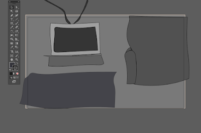


In contrast to this, everything about the outside world is colourful and vibrant in atmosphere. I have tried to reflect this further using elements such as sound the busy bustle of the urban city in comparison against the sound of the static when the television is turned on in Albert's house.
I carefully considered this when I was creating scenes for example the one where both of these worlds meet each other, when the activist stands at his door.

I think the contrast in these images is really effective in showing this barrier between the protagonist and everyone else. This helps to portray him in a vulnerable and isolated way.


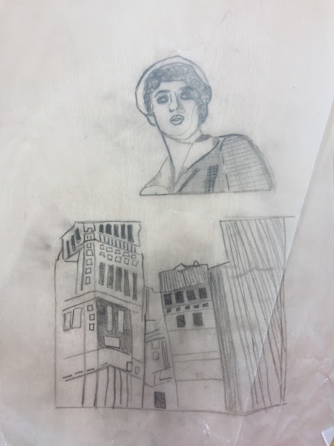
Creating the main protestor character
When designing my opposing character, the NHS activist I really wanted her to be as different as possible from Albert the protagonist. This is also true of the settings. Albert's house is really dark and crooked, a bit like him! So I wanted there to be a contrast as soon as the audience sees the outside, so I have used bright colours in this design. I decided since Albert was inspired by a character from Up, it would make sense for his opposition to look like a disney princess. I took close inspiration from Disney princesses such as Elsa from Frozen and Belle from Beauty and the beast.


Thursday, 11 May 2017
Tracing
In class, we started tracing some images to scan into illustrator to play around with, we used LED light panels to help us trace, they were really useful when looking at some of the finer details.


Aesthetics and ethics
Today's session helped me to develop an understanding of aesthetic and the importance of in in relation to concept, theme and visuals. These all have to explore the plot and idea fully.
E.G if a narrative has dark anf cynical tones, this should be easily identified through the aesthetic via mise en scene elements such as low shadow filled lighting and crooked design elements. This has made me think about keeping narrative and plot ideas simple and expressing this further through the aesthetic, visual and sound elements. I would like to research Len Lyes work further in the future as I admired his scratchy visual philosophy seen in his work.
E.G if a narrative has dark anf cynical tones, this should be easily identified through the aesthetic via mise en scene elements such as low shadow filled lighting and crooked design elements. This has made me think about keeping narrative and plot ideas simple and expressing this further through the aesthetic, visual and sound elements. I would like to research Len Lyes work further in the future as I admired his scratchy visual philosophy seen in his work.
Friday, 21 April 2017
Recent Animation: A Scanner Darkly
Recently I watched A scanner Darkly (2006) which was filmed digitally and then turned into an animation over a period of 18 months, this is also the case with another of Linklater's work "waking life" which I am also interested in watching in the future.
The way in which the piece was animated was very effective in enhancing the aesthetic of the piece, especially as the main theme of the piece was the war on drugs, and the protagonist's addiction so, the animation really added to the questionable psychological emphasis of the film.
This is the first film I've seen which uses animation over live action filming, which was very interesting and opened my eyes to the vast possibilities of animation and how this might continue to develop in the future.

Probably a bit too advanced for me to try and attempt in my work, but I very much admire the style and the way this method depicts well known actors in an animated fashion, the aesthetics of this is very pleasing.
Wednesday, 29 March 2017
Character development
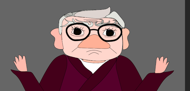
When communicating my narrative through my work, a key element to assist me in doing so is my protagonist. The role of the protagonist in any given story is to be at the heart of the action and tends to undergo some kind of emotional or philosophical change during the plot. The protagonist is someone who the audience can empathise with despite whether this character is good or evil.
When creating my particular protagonist it is important to consider that he is not a traditional "hero" or "good guy". I have designed him this way to present him as nothing more than a human, very capable of mistakes. I hope in this sense the audience will be able to sympathise with him. I have decided to make him a grumpy old man as there is something very endearing about this feisty but vulnerable character. We see this kind of protagonist or love interest in many films.
I took inspiration from characters such as Melvin from "As Good as It Gets"
 and Carl from "Up"

I created my character "Albert" using Illustrator as, I wanted to create him freehand but in a computerised cartoon style. I used images of these characters throughout my process to try and help myself stay true to what I was trying to create.
 It was important to me to make sure he was grumpy looking and had a rough quality to him, but also that he was endearing and there is something a bit cute about him, in order to do this I gave him big babylike features such as his eyes and nose but also gave him deep wrinkles and creases and bushy, wild eyebrows that move separately making him seem a little bit coarse and rogue. This will also be reflected in the way he moves as an animatic.
When creating my particular protagonist it is important to consider that he is not a traditional "hero" or "good guy". I have designed him this way to present him as nothing more than a human, very capable of mistakes. I hope in this sense the audience will be able to sympathise with him. I have decided to make him a grumpy old man as there is something very endearing about this feisty but vulnerable character. We see this kind of protagonist or love interest in many films.
I took inspiration from characters such as Melvin from "As Good as It Gets"


I created my character "Albert" using Illustrator as, I wanted to create him freehand but in a computerised cartoon style. I used images of these characters throughout my process to try and help myself stay true to what I was trying to create.

Subscribe to:
Comments (Atom)